
Colour psychology is the study of human behaviour in relation to colours. Did you know that the colours you use in your marketing can have a significant impact on how potential customers will view your company?
Each colour has its own connotations in the mind of the consumer. We subconsciously connect colours with specific feelings and emotions. Many companies have been using colour psychology to their advantage for years to evoke the desired feeling amongst customers to encourage them to purchase their products. Some of the biggest brands have even been influential in creating some of the associations consumers now hold.
In this blog we will cover the most common perceptions surrounding colours within marketing, which colours are associated with specific industries, which colours combinations work well and how to use colour psychology to your advantage.
Perceptions
Red 
Excitement, Youth, Bold, Power and Love.
This colour is often prevalent in branding within the food, beauty and entertainment Industries.
Orange
Cheer, Confidence, Comfort, Motivation and Enthusiasm.
Orange can often be found in the branding for sports teams, non-alcoholic beverages and construction companies.
Yellow
Optimism, Warmth, Joy and Happiness.
This colour is more likely to be used as an accent, as it can be a little full on by itself. However, it can be found in the branding for DIY stores, motor vehicles and snack food brands.
Green
Peace, Growth, Health and Balance.
Often showcased in tech, health foods and environmentally friendly brands.
Blue
Trust, Dependability, Strength and Calm.
Popular in finance, airlines, computer software and many companies who provide a service or product associated with water.
Purple
Creativity, Imagination, Wisdom, Luxury and Mystery.
Purple isn’t often used in any specific industries but can be seen in some popular brands who have made themselves stand out by using the colour. These include Cadbury, FedEx, Twitch and Hallmark – all of which have nothing in common!
Pink
Care, Passion, Sensitivity and Hope.
Shades of pink can be found in the branding for desserts, children’s toys and phone/internet providers.
Brown
Structure, Security, Safety and Honesty.
This colour is often used within industrial companies and on alcoholic beverages.
White![]()
Pure, Clean, Innocence and Peace.
White is heavily featured in health & medicine as well as home appliances.
Black
Sophistication, Control and Independence.
Often used in luxury brands, apparel and accessories.
Gold
Charm, Confidence and Prosperity.
Gold does not translate well on screen as, without the sparkle, it just looks like a dirty yellow. Therefore, it is mainly used in photographs and print advertising for luxury brands and jewellery.
Colour Combinations
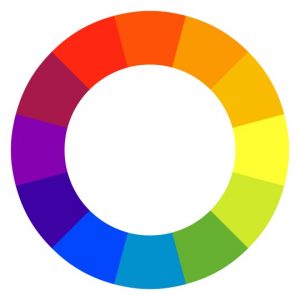
Complementary Colours
These are colours that are opposite each other on the colour wheel. Complementary colours are a good combination for making your branding stand out. However, make sure that you use one of the colours as a main/primary colour and the opposite one to provide an accent. A 50/50 split between complementary colours can be a little too intense on customers eyes.
Analogous Colours
This refers to colours that are next to each other on the colour wheel. These colours tend to belong to the same ‘family’ and share many of the same traits. This can help to create a more mellow and relaxing combination.
Monochromatic Colours
This is one colour that has been taken and split into different shades, tints and tones. This creates a very subtle and soft colour palette.
What you can do
- Have a good think about what feelings and emotions you want to convey with the particular piece of marketing or branded content you are working on and choose appropriate colours to represent this.
- Use a colour wheel to ensure your choice’s pair well together, experiment with different combinations of complementary, analogous and monochromatic colours.
- If you already have a specific colour that is prevalent in your logo or existing branding, try to include it in some of your marketing content.
- Be bold & unique while playing on existing perceptions. Just because the majority of brands in your industry tend to showcase one particular colour doesn’t mean you need to. Maybe use that colour as an accent rather than your main choice or focus completely on the feelings and emotions of the colours instead of those already common in your industry.
Bonus Tip:
Nature creates some of the most beautiful colour palettes. Look online for images of sunsets, forests, flowers, beaches etc. and use an eyedropper tool to identify the main colours in each image – this could be a great starting point.