Did you know that something as simple as the font choice for your website or logo can have an impact on how potential customers perceive your brand? You may not even be aware of the subconscious bias you have towards some brands for precisely this reason. As you have grown up, your brain has created connotations surrounding certain fonts and what they represent.
In this blog we will cover the basic styles you can choose, what associations they hold in the mind of the general public and which font choice may suit your company’s personality best.
Serif vs. Sans Serif
All fonts can be broadly divided into one of these two categories.
A ‘serif’ is a decorative addition to each letter, usually in the form of a stroke at the top or bottom of the letter that can sometimes look like little feet. One of the most well-known examples of a serif font is Times New Roman, which used to be the default when you first started a new word document. Generally, serif fonts are associated as being old fashioned, formal and respectable.
On the other hand, ‘sans serif’ literally means ‘without serif’ and refers to all fonts that do not feature the small lines described above. These types of fonts are thought of to be more modern and friendly. They are also better suited for readability on screens as opposed to print. You will notice that this blog is written in sans-serif.
Serif Categories
Old/Traditional Style
This refers to serif fonts that are based around the style of writing that was used as early as the 1400s and tend to have a varying stroke width as though written with a fountain pen or quill. Often, the thinnest section of the letter will be on a diagonal. These fonts tend to be used by businesses that are traditional, have an established heritage or want to be seen as sophisticated or serious. Many newspaper logos use traditional serif’s as their font choice. Another great example is Tiffany & Co.

Modern Serifs
These fonts tend to have a stark contrast between the thick and thin sections of each letter, with the thinner lines usually having a vertical or horizontal stress to them. These types of fonts have a classic, elegant look to them and are often seen in the logos of famous fashion designers such as Valentino & Gucci. The fashion magazine, Vogue, is a popular example.
Slab Serif
These fonts, as the name suggests, are chunky serif designs. They tend to be much thicker and more bold than other serif fonts. They are associated with confidence, solidity and reliability. You will find examples of this font choice in many car manufacturers and electronics brands. A well-known logo that features this font type is Honda.
![]()
Sans-Serif Categories
Grotesque/Neo-Grotesque
These are the most traditional of the sans-serif fonts. They tend to have a rather simple look to them and contain some of the most commonly found fonts, such as Arial. They tend to convey simplicity, functionality and reliability. These fonts are widely used in bold text orientated logos, often for electronics. A prime example is Nikon.
Humanist
This subcategory contains those that have the most legible font families and therefore are the most popular font choice for long paragraphs of text. They utilise the changing width within letters to make them as clear as possible to read. These font types are the most similar to hand printed text and therefore evoke feelings of warmth, trust and personality. A famous example is Adobe.

Geometric Sans Serif
This refers to fonts that, as the name suggests, are based on geometric shapes. They tend to have as few embellishments as possible and the o’s will be perfectly circular as opposed to oval. Geometric fonts also have the most standardised proportions, each letter will be as close to the same size as possible. These fonts have the connotations of being minimalistic, modern and innovative. Many famous companies have re-branded from more traditional serif fonts to geometric in recent years, most notably Google.

Unique Styles
Script
These fonts can be either serif or sans-serif, their only defining feature is that they mimic handwriting rather than print. However, this can often make these fonts more difficult to read. Therefore, they are not recommended for large bodies of text. When using a script font for a logo, your brand may be perceived as being whimsical, artistic or stylish. These fonts tend to be used by those in creative industries, particularly florists. A famous example however, is the Coca Cola logo.
Decorative
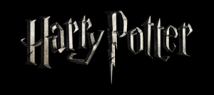
These are fonts that do not follow a set structure. They often have extra embellishments and perhaps even incorporate illustrations or patterns within the lettering. These types of fonts should never be used for copy, either on screen or in print. They should be strictly for a logo or title only. Some movies create these special decorative fonts for their posters and branding. A great example of this is Harry Potter.
Our final, and maybe most important tip is to avoid using fonts that have become an internet meme. Most popularly these include comic sans and papyrus. Comic sans used to be a cute, childish font that primary school teachers used to great effect. However, it now has negative connotations and is considered an embarrassment to use, especially by businesses. Papyrus is another widely ridiculed font, due to its overuse and unique look – it was inspired by ancient middle eastern writings. Don’t just trust us on the matter though, check out this hilarious sketch from Saturday Night Live as to why you should avoid this font.

